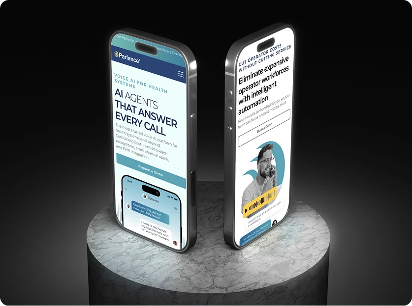
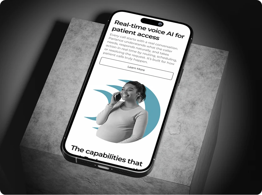
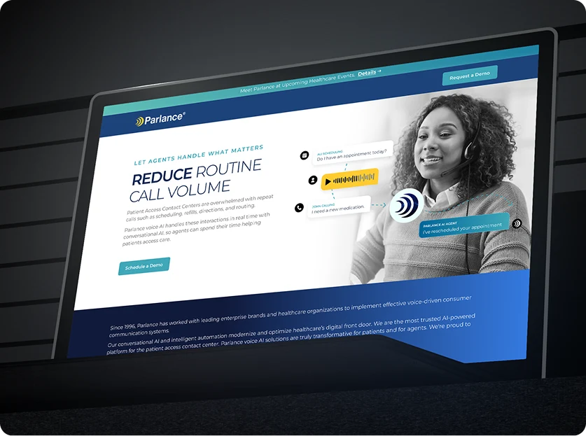
Case study · Parlance

Modernizing Parlance's web platform for scalable patient call management.

Parlance is the most trusted voice AI platform for health systems — 30+ years in healthcare voice AI, with conversational IVA & IVR, EHR integration, 400+ health systems served, and almost two billion calls answered. We owned the web platform that buyers, operators, and clinicians meet that product on — full-stack web build, enterprise UX/UI, and healthcare website design, coordinated as one surface.

ClientParlance
IndustryHealthcare · Voice AI
PlatformWeb (responsive)
StageIn market
ServicesWeb app · Enterprise UX/UI · Healthcare design
Parlance — modernizing patient call management for healthcare enterprises
—— The vision

The web platform a voice product has to live up to.

Parlance had the voice product. The web platform — where buyers, operators, and clinicians met that product first — wasn't carrying it. Our brief was to modernize the surface so the website did the credibility work the voice technology had already earned.

01 / The company

30+ years of healthcare voice AI.

Parlance has been doing voice AI for healthcare call handling for more than three decades — speech recognition, IVA & IVR, omni-channel reach, EHR integration. The most trusted voice AI platform for health systems, with deployments across health systems in the United States, Canada, and the UK.

02 / The category problem

Voice products live or die on the website.

Healthcare voice AI is bought by CIOs, telecommunications managers, and patient-access leaders who do their full discovery before they ever pick up the phone. The web platform isn't marketing fluff — it's the product's first impression on a buyer who hasn't heard the voice yet.

03 / The brief

A surface that matches the product.

A modernized web platform built on a structure that scales as Parlance's 400+ health-system footprint grows, with a brand voice that respects the depth of 30+ years and almost two billion calls answered underneath the surface.

—— The challenge

A web surface for three buyers at once.

Healthcare enterprise voice tech doesn't have one buyer — it has three. The web platform had to satisfy a procurement-driven evaluator, a clinical operations lead, and a CIO-adjacent technology buyer, all on the same surface.

Three buyers, one surface

A procurement-driven evaluator looking for fit and risk, an operations lead reading for everyday usability, a technology buyer scanning for architecture and security. The same set of pages had to answer all three.

A solutions structure that scales

Switchboard, Contact Center, Clinics, plus the Nuance Speech Attendant Replacement upgrade path — each one a real product, each one needing its own page that read consistently with the others. The architecture had to hold up as Parlance adds modules to the solutions surface.

Calm. Credible. Healthcare-clean.

No SaaS-dashboard aesthetic. No cluttered marketing-site signals. The look had to read as a serious clinical-technology product — clean hierarchy, accessible contrast, a brand voice the buyer trusts.

—— Design · information architecture

Solutions, proof, and a clear way in.

The IA splits the site into three loops — the solutions buyer-journey loop, the credibility-and-proof loop, and the direct contact-and-demo loop — so each persona finds their path without the others getting in the way.

The solutions loop is the load-bearing surface. Switchboard, Contact Center, Clinics, plus the Nuance Speech Attendant Replacement upgrade path — each one a dedicated page with the same internal structure: what it is, what problem it solves, where it fits in the patient-call pipeline, the EHR and HL7 integration story, and what kind of healthcare organization it's for. A buyer can land on any module and get the full read without having to learn Parlance's internal taxonomy first.

The proof loop carries everything that builds trust outside of the product pitch — publications, news, press releases, the kind of long-form material a serious enterprise buyer looks for when they're checking whether a vendor is still active, still investing, and still serious about their category. Structured to be browseable, scannable, and refreshable without engineering touching the page every time something new ships.

The contact loop is intentionally short. A buyer who's decided they want a demo shouldn't have to navigate three menus to start the conversation. Clear, persistent calls-to-action across the site funnel into a single conversation surface — the path from "interested" to "talking to a human" is the path that has to be friction-free.
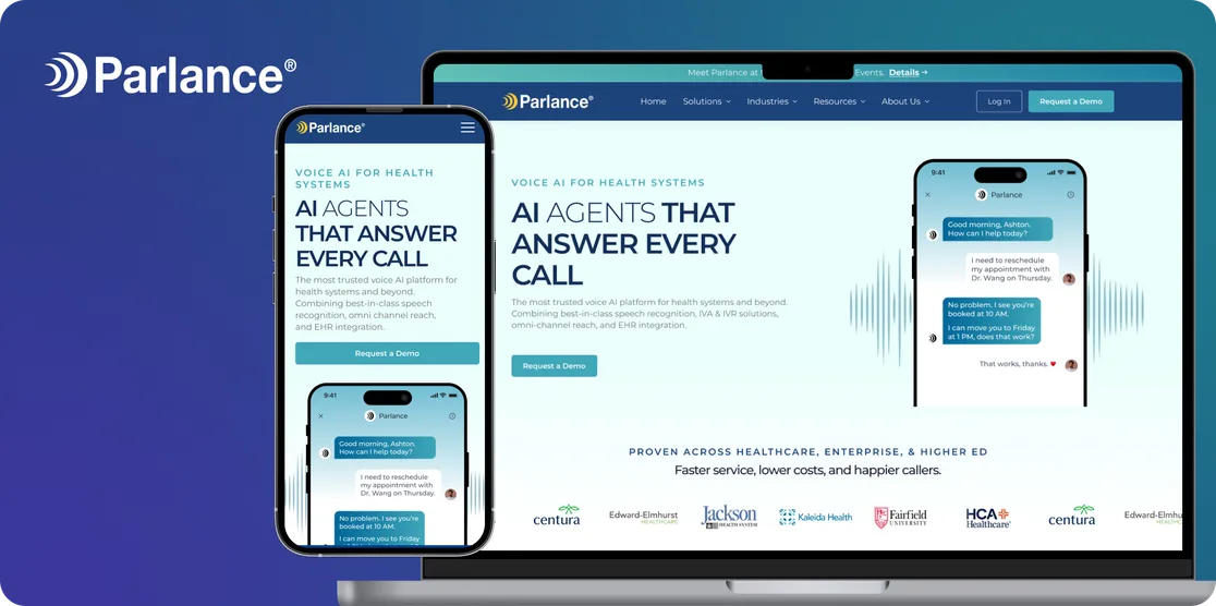
—— Design · UI

Clinical-clean. Built for the serious buyer.

A healthcare enterprise buyer reads the design before they read the product. Three rules ran every UI review.

01

Healthcare-grade visual discipline.

Clear hierarchy, accessible contrast, calm typography. The product is voice for patient calls — the surface had to read with the same level of care a clinician brings to the work itself. No marketing-site noise, no consumer flourish.

02

Voice-product credibility, visualised.

A voice product needs to read as serious technology even though the user never sees an interface. We carried that credibility into the imagery, the demo surfaces, and the proof loop — so the buyer trusts the depth before they hear the voice itself.

03

Mobile-first responsive.

Enterprise buyers don't just sit at desks. The platform reads cleanly on a procurement lead's phone during a between-meetings scan, on an operations lead's iPad during an evaluation review, and on a CIO's laptop during the actual deep-dive.

—— What we built

Six surfaces. One web platform.

A modernized brand surface, a solutions structure that scales, a proof loop the team can keep current, and the sales-ready paths in — coordinated as one product surface for Parlance's healthcare enterprise audience.

Modernized brand surface

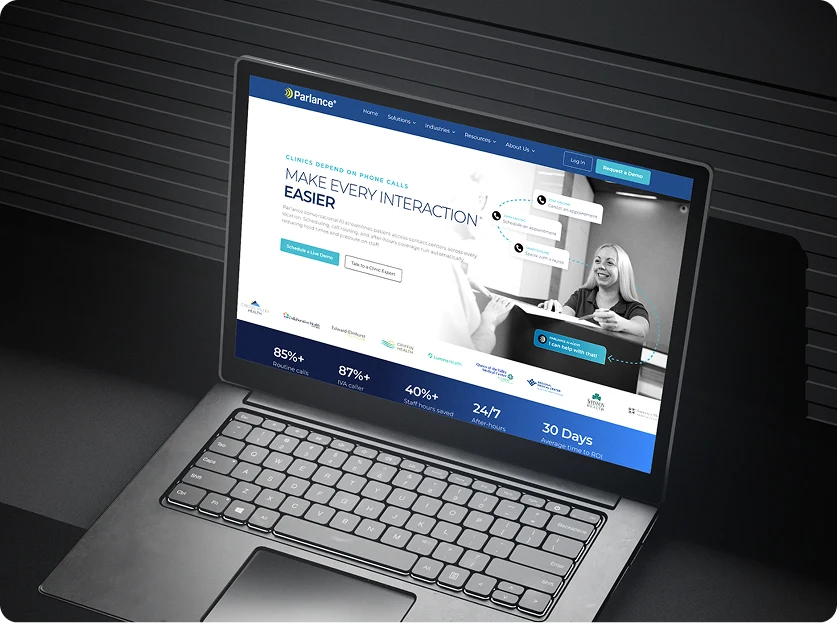
A refreshed look that matches the depth of the underlying voice product — calmer, more credible, more clinical. Typography, colour, photographic system, and the chrome that ties them together.

Solutions structure

A consistent page architecture for the real product modules — Switchboard, Contact Center, Clinics, and the Nuance Speech Attendant Replacement surface — each reading as a real product, each carrying the same internal sections, all easy to extend as Parlance adds new modules.

Resources + proof hub

Publications, news, press releases — the long-form trust-building material a healthcare enterprise buyer reads before they take a call. Structured for the marketing team to update without an engineer in the loop.

Mobile-first responsive layout

Enterprise readers, mobile devices — the platform reads cleanly across the full device range a healthcare buyer actually uses. Typography, hierarchy, navigation, and CTAs that translate at every breakpoint.

Trust signals architecture

The places on the site where credibility lives — customer logos from UCLA Health to HCA Healthcare, Luminis Health, Edward-Elmhurst, Torrance Memorial; testimonials from CIOs and patient-access leaders; the 400+ health-systems / ~2 billion-calls metrics; HIPAA-compliance signals — placed where the buyer is actually looking.

Sales-ready conversion paths

Persistent contact CTAs, a clear demo-request surface, and the structural decisions that get a buyer from "interested" to "talking to a human" in as few clicks as possible — without ever feeling pushy or pop-uppy.

—— The outcome

A surface that does the work the voice already does.

Parlance now meets healthcare enterprise buyers on a web platform that matches the depth of 30+ years in healthcare voice AI, 400+ health systems served, and almost two billion calls answered — across health systems in the United States, Canada, and the UK.

01 / What we shipped

A modernized web platform, end-to-end.

A coordinated web product — brand surface, solutions architecture for Switchboard / Contact Center / Clinics / Nuance Speech Attendant Replacement, resources hub, mobile-first responsive layout, and the sales-ready paths in — across the three disciplines Parlance asked for: web app, enterprise UX/UI, and healthcare website design.

02 / What it carries

A category leader's brand surface.

The first impression CIOs, telecommunications managers, and patient-access leaders get of Parlance now reads as serious clinical technology — calm, credible, healthcare-clean, and structured to grow as the product line grows and as the footprint expands beyond 400+ health systems across three countries.

03 / What we're proud of

A web surface that matches the product.

The depth Parlance's voice AI had been carrying — 30+ years, almost two billion calls answered — is now the depth the web platform leads with. The page tells the same story the product does, and the studio is quietly most proud of having closed the gap between the two.

—— On the screen

A closer look at the surfaces that shipped.

—— More from the studio

Three more apps. Three more outcomes.

If the Parlance story is the shape of your build — a serious enterprise product that needs a web platform to match — here's where else the team has shown up across the portfolio.